Le petit soldat is an interesting movie for where it sits in Jean-Luc Godard's career. It was made before the debut of Breathless so he wasn't yet famous, but not released until years later because of it’s controversial political content.
When Eric Skillman reached out to me to design the cover and packaging for the Criterion Collection edition, he described it as, “nominally about the Algerian War but really about the intersection of the individual and the political, how ennui/apathy interacts with real-world conflicts. It's also famous for a matter-of-fact torture sequence toward the end, plus it's the first time Godard worked with Anna Karina. That's a lot of ideas that don't necessarily sit together all that well —it'd be very difficult to evoke both Anna Karina's effortless cool AND the torture sequence.”
No kidding. OK, so maybe Karina’s cool and water-boarding weren’t going to easily occupy the same space but I was game for the challenge of working, metaphorically, a Venn diagram in which as many of these ideas overlapped on a cover as possible—if not within the entire package.
While far from a straight genre piece Goddard had made an espionage movie as a way in to those topics. I felt the design would serve the movie well if it did the same in a mid-century, avant garde kind of way.
The look isn’t so very different than what I’d established for the Criterion Collection edition of Godard’s Vivre sa vie. Indeed, both movies come out of the same era. It can be useful when the movies in the collection by the same director share an aesthetic. It helps to unify and give a series of releases a cohesive point of view.
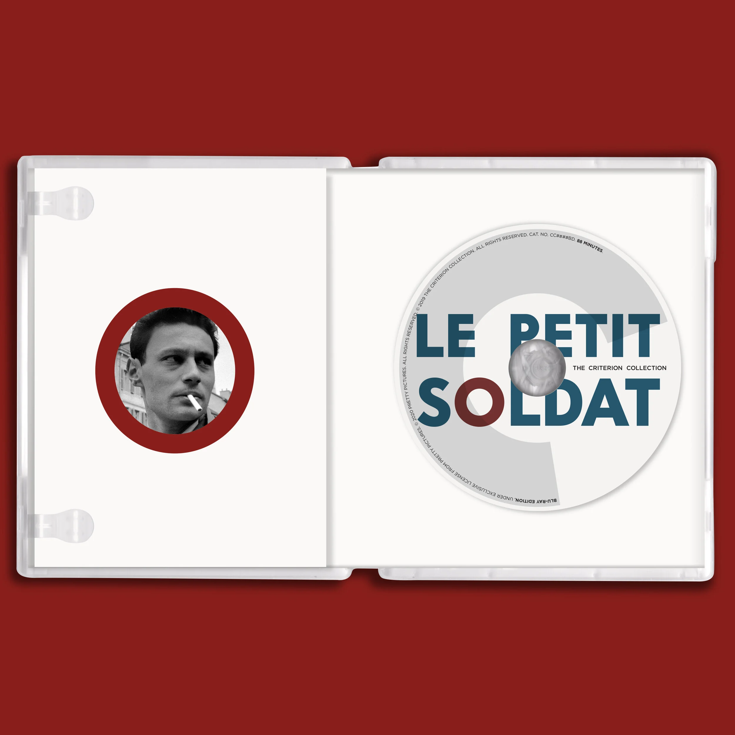
Godard’s movies from the ‘60s have a way with type. Words matter. There are very few titles in Le petit soldat yet there’s enough to infer a direction or two. Its a black and white movie, so I could have justifiably limited the design to one color and that might have worked. Still, I think the addition of the blue and the red contributes some layers of meaning as well as enlivening the package.
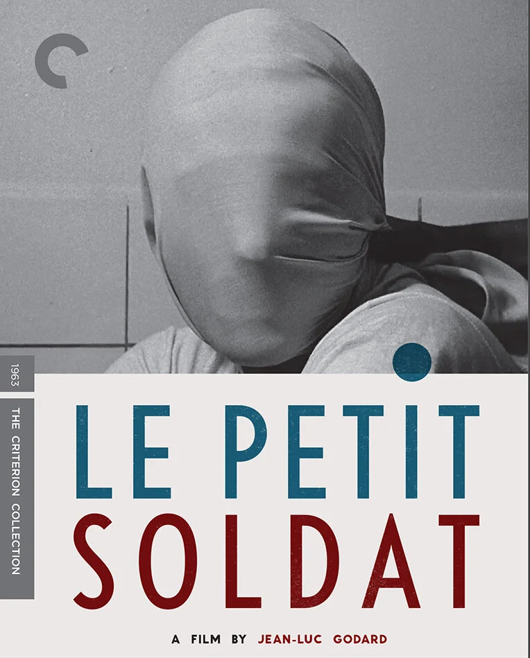
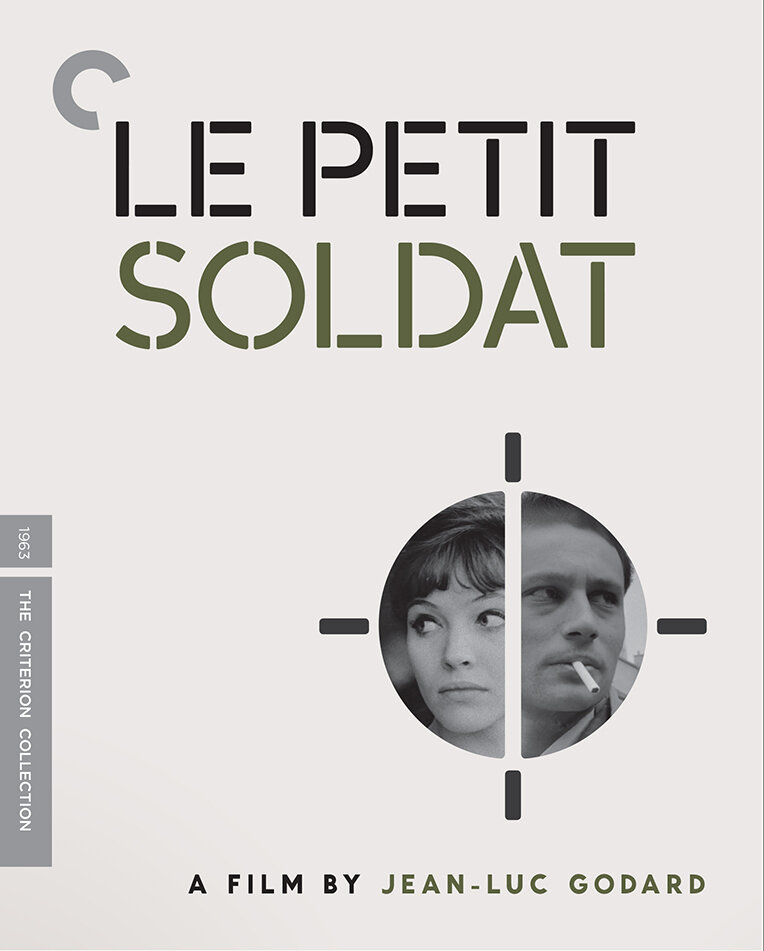
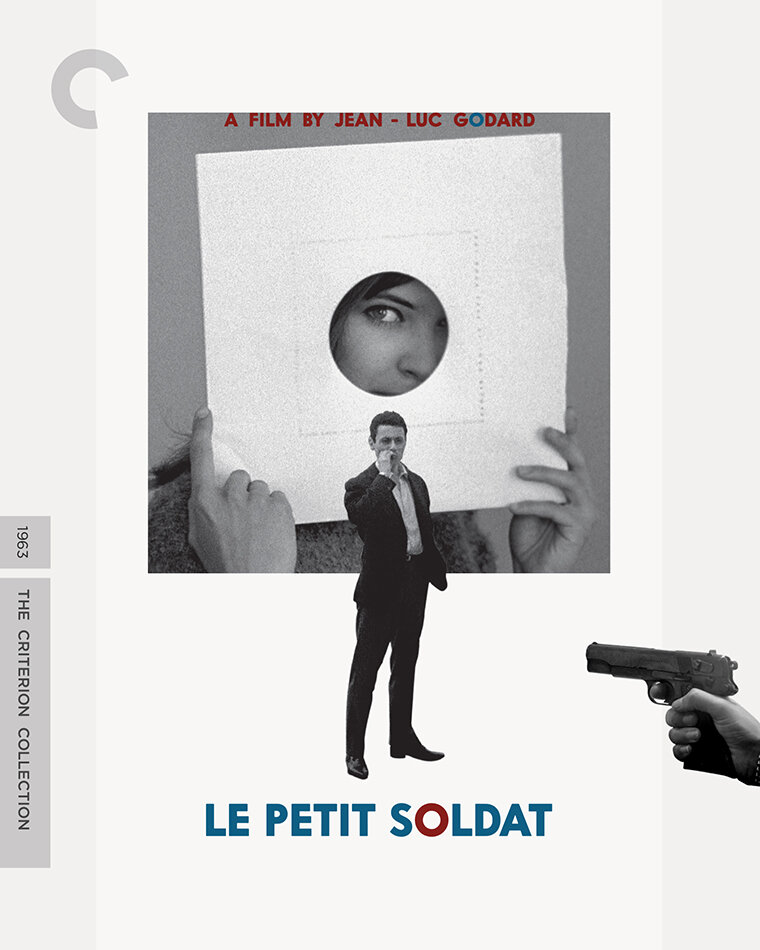
These roughs —mostly in the order they were created— illustrate a bit of the cover making process. One of Eric’s notes to me expressed his hope we go minimalist with the cover even more so, perhaps, than Vivre sa vie —that white space was our friend. That art direction stayed with me head but it was tricky. This movie is about two people which meant there would always be one more element on this cover compared to Vivre sa vie.
The second and third designs were among the final considerations for the cover. The repeating typographic pattern, meant to suggest a strip of film as shooting gallery, was inspired by the line from the movie “Cinema is truth at 24 frames per second”.
The other leading contender was the photomontage that would eventually become the cover. I submitted a few designs using stencil fonts, the photomontage was one of them them. Word from Criterion was that it felt too military for the story. A type exploration to hash-out an alternative followed and that led us to the select. I was stoked when it got picked. There’re fewer things more gratifying as a designer than seeing one of the good ones make it to head of the line.


