The King of Jazz

KOJ_BD_COVER.jpg

King of Jazz is crazy pants. It’s a two-strip Technicolor fantasia directed by John Murray Anderson that’s been lovingly restored in all its lurid, can’t-look-away glory and presented in the highest quality by the Criterion Collection. If you know anything about music of the 1930s then you may question the movie’s assertions concerning jazz royalty. Such questions would be grounded in reason. You may need to put reason aside for this one in exchange for the unfolding spectacle. Giant pianos! Showgirls that tower over the streets of Manhattan! Oswald the Lucky Rabbit! All singing, all dancing, King of Jazz just about has it all and it’s brought to you through the strange magic of the two-strip Technicolor process. Red and green may not fully render the color spectrum but what color it does render is glorious.

The risque cover to this edition is a repurposed, vintage Film Daily advertisement that likely promoted the picture to exhibitors. It required some work to make the art camera-ready for the package. Art Director, Eric Skillman, provided it with the ad copy already removed. It was then up to me to recreate the lettering along the bottom in order to accommodate the director’s name. We also wanted to remix the color so that it drew from the two-strip palette and integrate better with the film imagery used throughout.

king of jazz ad_filmdaily.jpg

The name of the game with King of Jazz is variety. The structure of the movie owes more to vaudeville than the conventional Hollywood musical. There are some spoken intros and a handful of skits but there’s no over-arching narrative. It plays like a night at the Orpheum only with the overlay of seriously inventive movie magic.

KOJ_INTERIOR_.jpg

It felt to me the best compliment to that structure is to cram as much variety into the typography as possible, so that the pages of the 16 page booklet as well as each screen of the DVD menus would offer something special at every turn. The type styles and techniques come straight from the jazz age yet were filtered through the movies quirky sensibilities.

koj_spreads.jpg

The collages, mirroring and kaleidoscopic imagery in the booklet —all techniques used in the movie— are born of practical necessity. The pictures are all frame grabs from the movie. Even when the source is high resolution, it tempts the fates to use frame grabs from a movie of this era. The grain structure can be formidable. You’ve got to reduce the size of a picture in order for it to tighten up. By creating backgrounds that are assembled of multiple frames that have been reduced over all, the integrity of the pictures hold up a lot better. The feeling I hoped to impart with the booklet was something that felt like a theater program handed out of the night of the big show.

KOJ_MENUS_1.jpg

La Vérité

LA_VERITE.jpg

A courtroom procedural, a family drama, a tale of impulsive and wayward youth, Henri-Georges Clouzot’s La Vérité is many things, not the least of which is it’s star, Brigitte Bardot. The Criterion Collection has a tradition of period Bardot illustrations on it’s covers. (Contempt, And God Created Woman) Their edition of La Vérité is no different. The image for this one—or at least the photo from which it’s created—was used for the original release, although I haven’t found the poster that uses exactly this painted version. (If anyone recognizes it, please let me know.)

The movie’s title translates as the truth. As the story unfolds, we see the truth, subjective as it is, as a weapon turned on anyone getting in it’s way. How best to present the title? The artwork is stark, dramatic and, well, Bardot. Competing with that face is a fool’s errand. The type should be evocative but not competitive.  Best to back off and compliment what’s there. I looked at white title treatments as well as gray ones but they muddled the illustration and diminished the impact of the black background. Red seemed like the best choice for color. Symbolically it hits the right notes. (passion! blood!) Plus it shares the space with all that blackness without taking away from it —or her.

There’s a pleading quality to Bardot's face here so I tried a few solutions with the title close to her mouth — suggesting the truth was her’s to utter. That works. The ones at a larger scale superimpose the truth as a label for the movie. The truth in this configuration belongs as much to the story as a single character. That works too. 

LA_VÉRITÉ_alts.jpg

The serif samples, above, are something I drew up based on the movie’s main title card. You find a lot of typefaces like this in mid-century French films. There was a vogue for old style serif’s like Georg Trump’s Trump Medieval and this one shares those qualities. The painterly title treatment invokes a counterculture/protest vibe that, to me, was both simpatico with the cover portrait style as well as the discontents given voice throughout the movie. It would be another eight years before the youth of France would take to the streets but seeds of ‘68 are in evidence in la Vérité. The geometric sans serif has proportions more suited for signage than the printed page and so imparts an institutional quality. There’s a cold, objectivety to it. The consensus leaned toward a sans serif but one that didn’t go on top of the illustration as much. This version would have been lost had it been simply scaled down, so that led to the condensed sans serif that became the cover.

LA_VERITE-INTERIOR.jpg

The typeface is Alternate Gothic. It has an unfussy, utilitarian affect. At this scale it shouts like a newspaper headline yet its also the kind of typeface one expects to encounter on any number of bland, ministerial forms of, say, a police department, a woman’s prison or the justice system. Name, address, date of birth, check all boxes that apply —that sort of thing. There are reams of paper evident throughout the film. We hardly get a close look at them except to see they’re all typewritten documents and forms. There are piles on the courtroom tables and under the arms of lawyers. The reports, the depositions, the motions, all of it comprising the truth in the form of paperwork underpins the courtroom scenes as supporting player. The cover, the packaging and the DVD menus for la Vérité are designed to support that through-line.

LA_VERITE_INSERT.jpg
LA_VERITE_MENUS.jpg

David Crosby, Remember My Name

david_crosby_remember_my_name.jpg

I’m pleased to share my poster design for a documentary making it’s debut at the 2019 Sundance Film Festival, “David Crosby Remember My Name”. I really enjoyed working with the folks at PCH and Vinyl Films, they’re great collaborators. The material for the documentary is rich and it runs deep, so we weren’t lacking for something interesting to say or show for a poster —and the desire was there too. As we wrapped up our initial meeting it the director, A.J. Eaton’s parting note was ‘go bold!’. I think the image by photographer Henry Diltz meets the criteria. Special thanks to David Crosby, director A.J. Eaton and producers Cameron Crowe, Michele Farinola and Greg Mariotti.

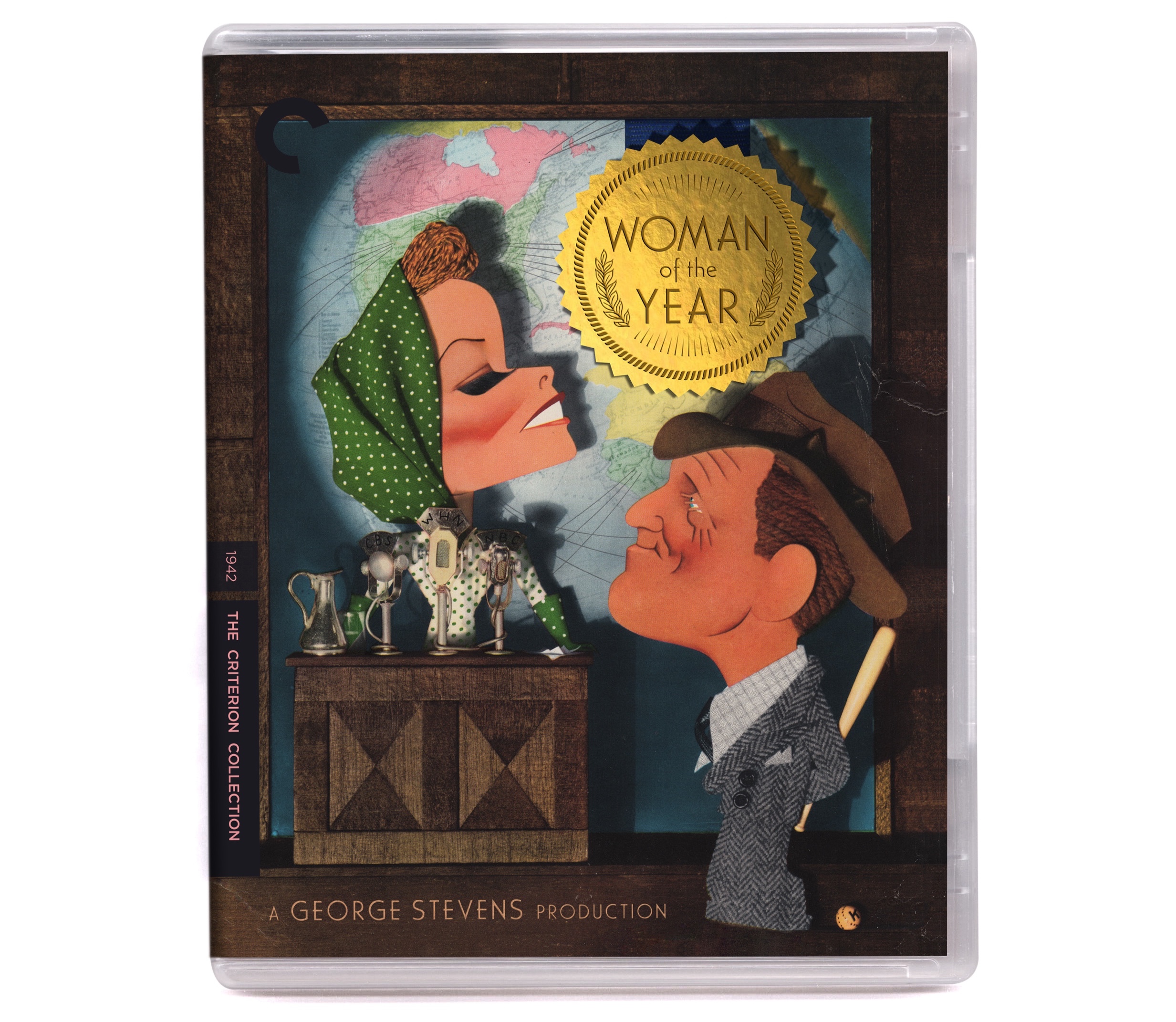
Woman of the Year

WOTY_TITLE_TREATMENT.jpg

A designer likes to be noticed. Its gratifying to do work that calls attention to yourself. Its one of the ways that we get more work —often more of the kind of work we want to get. I'm that way. I'm also the kind of designer that feels like the solution should come from the problem —and when you've been handed a piece of (vintage!) artwork by the great Jacques Kaperlik, try not to step all over the thing. That's where I found myself when asked to design for the Criterion Collection edition of George Steven's "Woman of the Year" (1942).

I'm not entirely sure of the original context of Mr. Kaperlik's wonderful illustration, whether it was for a magazine promotion or an unused piece of studio publicity but he thoughtfully left a generous bit of space in the upper right for a title treatment to live. All I knew is that I wanted to be as unobtrusive as possible and --whatever I made-- that it looked like it belonged. Ideally, it would look as if it had always been there. 

Woman of the Year is itself of course, an award so a blue-ribbon medallion of sorts seemed like a natural. I played with a bunch of different shapes and one that radiated like a bright sun, which gave the composition added warmth, won the day. The fun/tricky part was selecting typefaces which suggested golden-age early 40s Hollywood and making the medal appear as if Mr. Kaperlik had something to do with it.

At the time I was solving for the cover image though it wasn't long after that it became apparent that the medallion and ribbon motif presented abundant visual opportunities throughout the package. So as it turns out, even when one designs to be unobtrusive and in the service of an illustration there are still opportunities to show off. Presented here along with the cover is the package interior, samples from the insert as well as samples of the DVD menus.

WOTY_.jpg
WOTY_INTERIOR.jpg
WOTY_INSERT.jpg
WOTY_MENUS.jpg