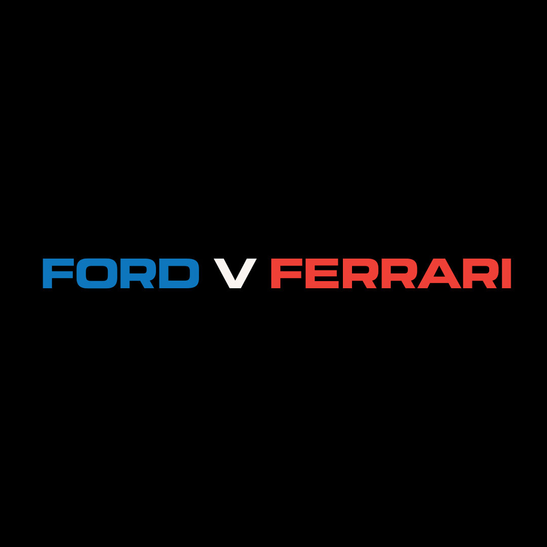
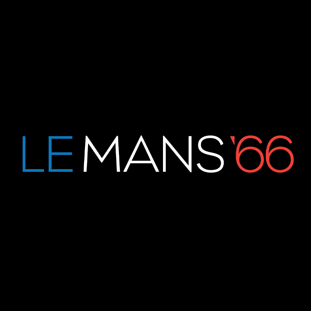
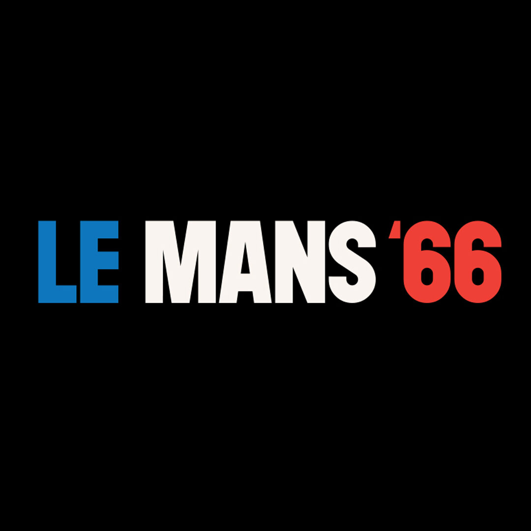
Ford v Ferrari marks the ninth(!) time I’ve designed a title sequence for director, James Mangold. Obviously, the two of us go way back. Jim’s a great friend who’s also great to work with. This time around it’s a movie about the legendary rivalry between auto racing giants Ford and Ferrari in the mid 1960s. It stars Christian Bale as race car driver Ken Miles and Matt Damon as automotive designer Carrol Shelby. Ford v Ferrari has been nominated for four Academy Awards including Best Picture. How cool is that?
I partnered with another great guy to work with, William Lebeda at Picture Mill on this. Bill and I worked together on JM’s previous features, Logan and The Wolverine. The two of us share a lot in common, not the least of which was a ton of enthusiasm for the movie. After getting an early look at FvF we knew it was something special and weren’t at a loss for where to start.
I took my first inspiration from Françious Audouy’s production design for the picture, which is a bounty of period signage, labels and other typographic details. Additionally, I paid a visit to the Petersen Automotive Museum to check out first hand the work of Carrol Shelby (played by Damon in the film). There’s many epiphanies to be realized when the car is right there in front of you. I also amassed a bunch of related printed ephemera from the era. A sensibility and direction soon emerged.
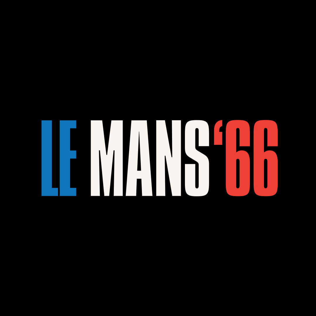
We needed to work out two titles for the movie: Ford v Ferrari as well as Le Mans ‘66. (In some territories brand names can’t be used in a title without prior consent and none would be sought.) Any solution to be considered needed to work for each.
Credits appear over black up until the main title, the rest play over four scenes establishing the main characters. They needed to have a confident presence without distracting while also doing something to establish story. In other words: look like they belonged and were appropriate to the time and place.
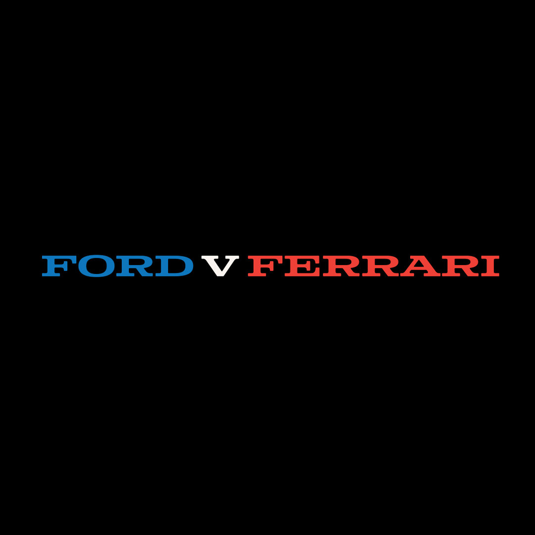
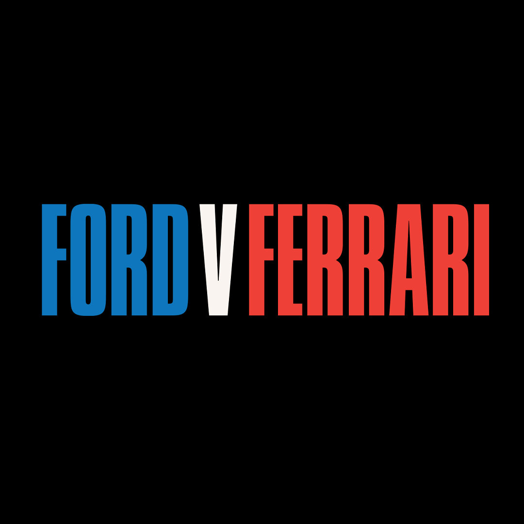
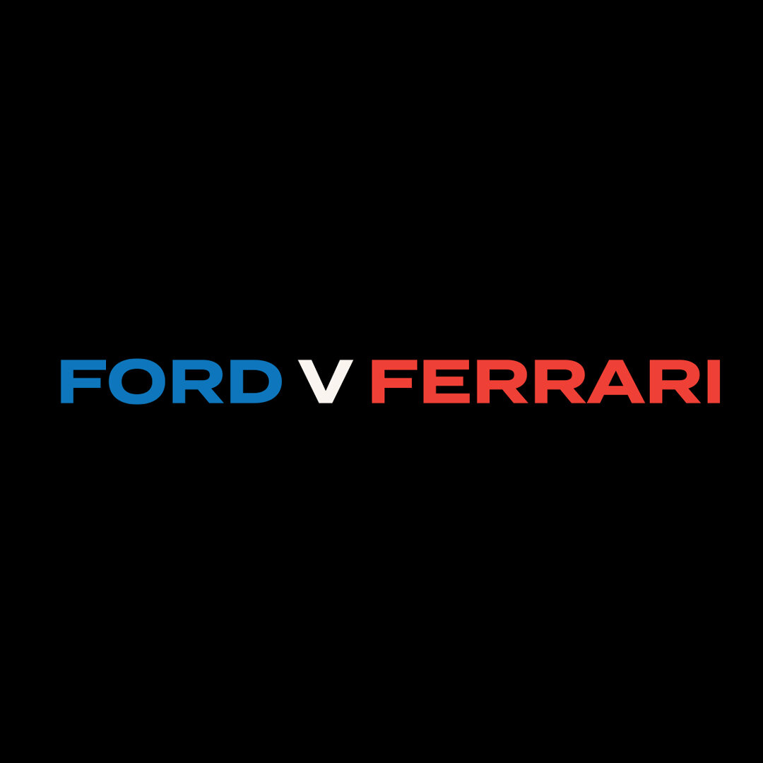
I really wanted to get color in there. Color plays an important part of the story. Ford = blue and Ferrari = red. Making color part of the main title treatment seemed like a natural. Particularly over the black background. Once the titles were playing over action they’d go white.
Several pitches were created with color but the effect of it just wasn’t working for JM. For Jim the color played like an overlay of branding —movie as product— and that wasn’t a tone or expectation he wanted to establish for the movie. Which isn’t to say he didn’t like it at all, he actually found them persuasive and wanted to reserve the treatment for the movie’s publicity. Which he did. Those initial title treatment concepts later came to life on the movie poster and trailers.
With color considerations out of the way, it came down to two options (from roughly a dozen) by the end of the first meeting: a bold extended sans serif which would have fit as easily on racetrack signage as it would a Deerborn office building circa 1966, and an extended serif which could have had a life as a nameplate on car while at the same time made allusions to an old and vanishing west, well suiting the maverick characters at the heart of the story. I think JM could have gone either way with it.
The proof of the pudding is in the tasting. A full sequence was created with both of the typefaces to see how each played. Ultimately the sans serif —a typeface called Termina, designed by Mattox Shuler—prevailed. Both looked really good and each conveyed, in their way, the spirit of the movie. Given the credits to be composed and the action over which they would appear Termina proved to be the more readable of the two. The checkered flag was waved.

