Now Playing

"The symbol became so synonymous with the film that it was possible to remove the actual text of the title in certain instances." Saul Bass, A Life in Film & Design Jennifer Bass & Pat Kirkham This clipping from the Los Angeles Times amply makes the point. It gives too a sense of what typical newspaper film advertisements looked like then and how much Bass's work challenged those conventions.

This post, as well as the two following, show some Anatomy of a Murder material you won't find in the Bass biography. But then it would have been considerably more than 424 pages to include everything that came out of his studio. Get this book!

• Saul Bass, A Life in Film & Design

Anatomy Of A Murder


The Criterion Collection will release Otto Preminger's Anatomy of a Murder on Tuesday, February 21. Really, what else could possibly make the cover but the great, Saul Bass poster art for the film's original release? Bass wrote the book on film branding and he did far more than the iconic anatomized silhouette that adorns the one sheet. He developed a campaign which was rigorously applied to a host of collateral materials: press releases, letterheads, screening invitations etc. which culminates in one of the great title sequence experiences designed for film.

Criterion enabled me access to the Saul Bass Papers at the Academy of Motion Picture Arts and Sciences/ Margret Herrick Library where I was able to see first hand those materials. Exciting stuff for this graphic designer, film buff and resident Angeleno. It hugely informed the design of this release.

Presented here, in addition to the cover featuring the aforementioned Bass one-sheet art, is the wrap-around cover for the booklet insert --my version of another, lesser seen Bass one-sheet-- as well as some examples of the DVD menus. Thanks and much appreciation to producer, Susan Arosteguy, art director, Sarah Habibi and art production coordinator, William Brese.

Click any image to enlarge.


George Harrison, Living in the Material World


George Harrison, Living in the Material World will play at the New York Film Festival this October as part of the Main Slate. I had the distinct pleasure of working with Olivia Harrison designing this poster for the Martin Scorsesse directed documentary. I love this image of George Harrison. It's got just enough Beatles-era pop but at the same time transcends all that and goes right to that spiritual/metaphorical iconography we've come to associate with the man.

Kiss Me Deadly

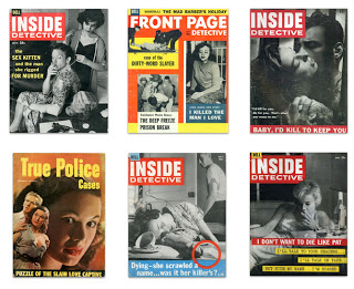
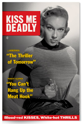
When The Criterion Collection asked me to design the packaging for the great Robert Aldrich noir, Kiss Me Deadly, they had a particular direction in mind. They wanted to present the lurid and sensational detective picture in the style of one of that era's counterparts, the lurid and sensational detective magazine. A natural combo. I was only too happy to oblige.A few days latter they sent a terrific volume featuring covers --and a few spreads too-- from Inside Detective Magazine, True Detective Magazine, True Police Detective Magazine, you name it.  Almost all were from the mid 1950s.

The best of them, I think, belongs to Dell's Inside Detective. Their covers were stark and immediate --often just two-color, though occasionally three. Their frequent use of the all-American Franklin Gothic presses just the right tabloid button. This was quality sleaze. 

These are some my initial sketches which lead to the finished cover:  (You can click through all the images in this post to enlarge.)

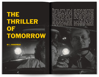
Here are samples of the twenty page booklet which accompanies the disc.

*

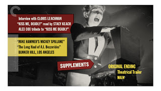
As well as some menu designs.

*

* Pardon the place-holder copy!

My sincere thanks to The Criterion Collection for making me a part of this one.

 The Criterion Collection