
When The Criterion Collection asked me to design the packaging for the great Robert Aldrich noir, Kiss Me Deadly, they had a particular direction in mind. They wanted to present the lurid and sensational detective picture in the style of one of that era's counterparts, the lurid and sensational detective magazine. A natural combo. I was only too happy to oblige.A few days latter they sent a terrific volume featuring covers --and a few spreads too-- from Inside Detective Magazine, True Detective Magazine, True Police Detective Magazine, you name it. Almost all were from the mid 1950s.
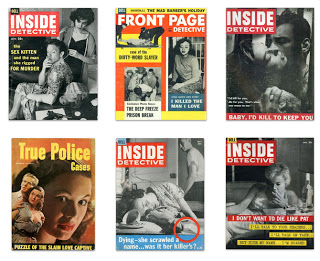
The best of them, I think, belongs to Dell's Inside Detective. Their covers were stark and immediate --often just two-color, though occasionally three. Their frequent use of the all-American Franklin Gothic presses just the right tabloid button. This was quality sleaze.
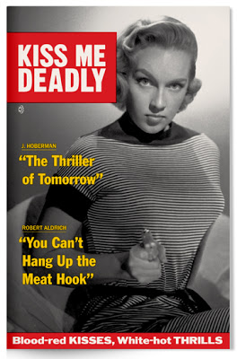
These are some my initial sketches which lead to the finished cover: (You can click through all the images in this post to enlarge.)

Here are samples of the twenty page booklet which accompanies the disc.
*

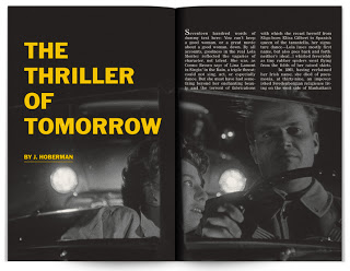


As well as some menu designs.
*




* Pardon the place-holder copy!
My sincere thanks to The Criterion Collection for making me a part of this one.
The Criterion Collection
