 "How about some Hitchcock?" asked Criterion art director, Sarah Habibi in the subject of an e-mail last January. Um, sure. (Really, is there any another answer to that?) Criterion was set to repackage The 39 Steps as they had recently done with The Lady Vanishes and were looking for a way to pair them well together. To me that signaled some period type and an old school poster vibe.
The 39 Steps is great cloak-and-dagger fun --the prototype for the wrong man, cross-country intrigue which he would later embellish, elaborate and build a Hollywood career upon. It was made at the height of Hitchcock's years in Britian and is said to be his favorite from that era.
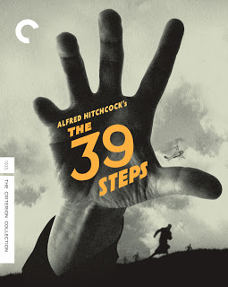
 Central to all of it is the MacGuffin -- a kind of who-knows-what secret spy ring that --well, I'm not going to spoil it but it served as premise for the first cover here.
The cabal leader is known for a conspicious physical deformity and his reach is all pervasive. You can run but you cannot hide, that sort of thing. Criterion was jazzed by the image of the reaching hand, they loved the energy of the thing, but in the end it was felt that the image bore too strong a comparison to M despite the fugitive digit.
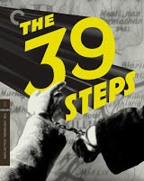
The photo-montage of the cuffed pair over a map of the Scottish highlands --where much of the story takes place-- renders a certain amount of dramatic tension yet does it say enough about the movie? I enjoyed positioning the map so the letters KILL ominously peak out from beneath the title treatment. Thank you Mr. Hitchcock.
It's worth reminding that The 39 Steps is also a terrific romantic comedy. There's a great publicity photo of actors Robert Donat and Madeleine Carroll shot during production, cuffed and hiding under a bridge. Showing the two leads bound together personalizes the experience more and it surely brings the glamor. Still, it's a well traveled image and perhaps in the end, a little too much been there seen that.
 Despite the reaching-hand-of-the-39-Steps cover having been rejected, it stirred a lot of interest. It felt like fertile territory to explore further. Production photography really wasn't affording the dynamism needed to describe the excitement of the film so I turned to frame grabs in hopes of creating a few alternatives to my initial concept.
The chase across the moors is a terrific set-piece in the movie. Hero, Richard Hannay is pursued by Scotland Yard both on land and from air -- in the form of a really cool whirlybird! The sequence is all shadow, light, sky and clouds with great use of scale. A real standout. I pulled the best from it and came up with a few more montages.
The first had Hannay close to camera with his pursuers behind him. It was getting there but I was missing a particular use of scale which I think Hitchcock utiizes so effectly during that chase. It wasn't really speaking the language of the movie. So, good but not great.
 The next illustrates the reveal during the pusuit as Hannay discovers a residence of great importance to the plot. It's a quieter moment than the straight-out chase. Still, it underscores the mystery. It also implicates the enigmatic title into the proceedings in a way that the chase covers don't. Perhaps, even, can't. Just what are the "39 Steps" anyway? --and do they lead to this place?
Finally, building upon many of the same elements of the reaching hand comp, the montage which would become the cover. Hannay takes the center spot, surrounded on all sides by his pursuers. The scale of all the elements was in keeping with the tone of Hitchcock's film. Just right. It and felt at once a classic yet with a fresh, modern take. Criterion agreed and our chase was over.


