Brief Encounter

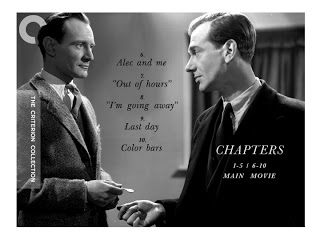
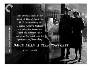
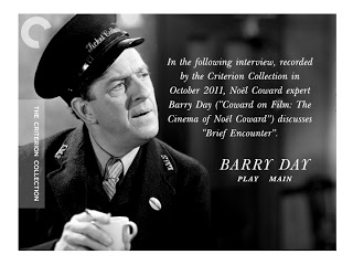
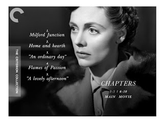
Some menu designs for Brief Encounter, the fourth film in the boxed set David Lean Directs Noël Coward. One of the challenges designing this set was creating a unifying visual theme for the four films --something that would tie them all together. Still, I didn't want them conforming rigidly to a single template. Changing up the typefaces was a good start but at the same time I wanted to take things a little further than that. Formally speaking, the set is bookended by two black and white films with two color ones in between. Should the black and white menus have one look and the color ones another? That seemed too on the nose and unnecessarily segregated. Every other film receiving similar treatments felt better. So these menus for Brief Encounter echo the visual themes I established with the Blithe Spirit menus, just as This Happy Breed echos the motifs of the menus for In Which We Serve.

• David Lean Directs Noël Coward

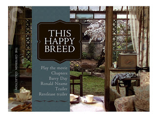
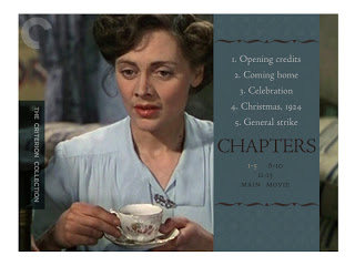
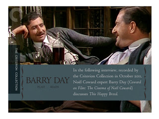
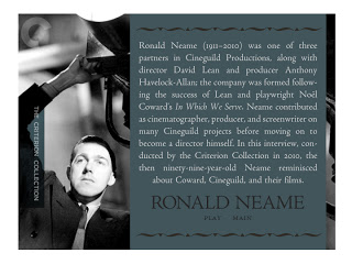
This Happy Breed

DVD Menu designs for This Happy Breed, the third film in the boxed set David Lean Directs Noël Coward. The master for This Happy Breed is simply beautiful and about as sensitive a rendering of color as one would expect from The Criterion Collection. Though you may detect a quality shift for a couple of the images on these menus here. That's an affect of the design process. Those stills weren't available to me at the time the menus were designed, so I worked with place-holder images knowing they'd be traded-out once the work left my desk. Menus, by the way, are often designed in advance of the packaging (though not the covers) due to the time required to produce the discs.

• David Lean Directs Noël Coward

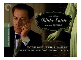
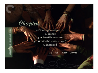
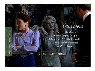
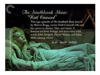
Blithe Spirit

Some menu Designs for

Blithe Spirit

, the second film in the boxed set 

David Lean Directs Noël Coward.

I wanted to keep all the typefaces for the set distinctly British. Most of the faces I used were originally designed by either Eric Gill or John Baskerville. The script-face here is called Ariston and it comes out of the early 20th century vogue for 'royal' typefaces. I think it, along with the flourishes lend a certain aristocratic air to the proceedings while at the same time playfully insinuates the intrusion of a certain, feminine "other".

• David Lean Directs Noël Coward

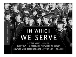
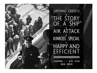
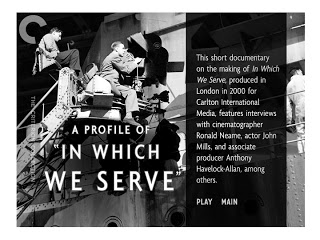
In Which We Serve

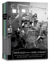
David Lean Directs Noël Coward is a terrific new boxed set which The Criterion Collection is releasing March 27th. It contains Lean's first four films --all collaborations with Coward. I designed the package as well as menu designs for the DVDs. I'll have more to say in the following posts, including a process post on the packaging as well. To start, here are some of the DVD menu designs for the first of the four, In Which We Serve

.

• David Lean Directs Noël Coward

Children of Paradise

Poster for the Janus Films release of the restored Children of Paradise.

The beautiful painting was created by production designer Alexandre Trauner for the 1945 film. I got a peek at several of the production design paintings while working on this and they're all pretty sprecial.

For the poster, art director Sarah Habibi invited me to compose a title treatment based on the main title card, translating the original, les Enfants du Paradis. The title sequence is a gorgeous mix of French scripts and display faces --all hand lettered, naturally. This solution would be no quick trip to the font library. All of my letters are custom drawn too.

The spectacularly restored film is making it's tour of the U.S. this spring. For more information on Children of Paradise, the touring schedule --as well as a video demonstration of the painstaking restoration proces-- be sure visit the Janus Films website.

• Janus Films